
A Cornucopia of Creativity: Thanksgiving Graphic Design Through the Decades
PROCESS STUDIO
Thanksgiving, a holiday steeped in tradition, gratitude, and a bountiful feast, has always offered a rich canvas for graphic designers. From quaint, hand-drawn motifs to sleek, modern interpretations, the visual language of Thanksgiving has evolved alongside broader design trends, reflecting cultural shifts and technological advancements. A look back at Thanksgiving graphic designs over the years reveals a fascinating journey through changing aesthetics, while always circling back to the core themes of harvest, family, and togetherness.
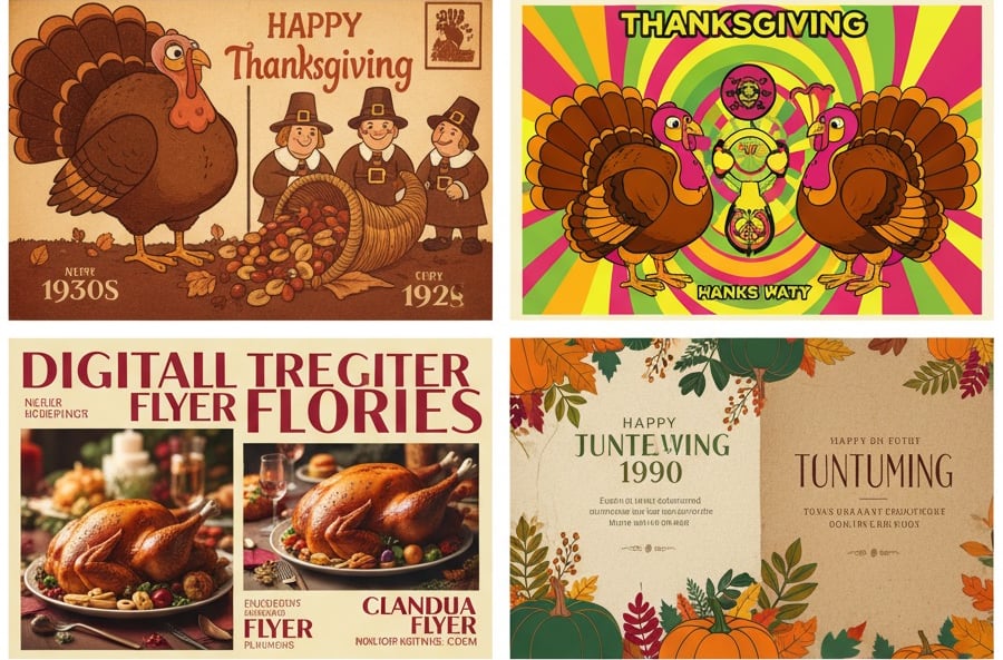
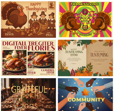
In the early to mid-20th century, Thanksgiving graphic design often exuded a charming, nostalgic simplicity. Think of vintage postcards and advertisements from the 1930s and 40s. These designs frequently featured illustrations of plump, anthropomorphic turkeys, cheerful pilgrims, and bountiful cornucopias, all rendered in warm, autumnal palettes of oranges, browns, and deep reds. Typography tended towards classic serif fonts, often with a hand-lettered feel, emphasizing a sense of tradition and home-spun warmth. The overall impression was one of wholesome, Rockwellian idealism, perfectly aligning with the sentiment of a post-Depression and wartime America finding solace in family and community.
As the decades progressed, particularly into the vibrant 1960s and 70s, Thanksgiving design began to embrace more stylized and abstract elements. While the core iconography remained, turkeys might be depicted with bolder, more geometric shapes, and pilgrims could take on a more minimalist or even psychedelic flair. Color palettes expanded, with brighter hues and more adventurous combinations appearing, sometimes reflecting the broader pop art movement. This period saw a move away from purely illustrative realism towards a more conceptual and playful approach, aligning with a society that was increasingly questioning traditional norms.
The late 20th century brought further diversification. The rise of desktop publishing and digital tools in the 1980s and 90s democratized design, leading to a wider range of styles. We saw a mix of highly detailed, almost photorealistic illustrations coexisting with simpler, vectorized graphics. The focus often shifted to elegant typography and sophisticated layouts for holiday greeting cards and formal dinner invitations. There was also a growing emphasis on incorporating natural elements like leaves, pumpkins, and gourds, often in more refined and less cartoonish ways, highlighting the beauty of the autumn harvest.
Entering the 21st century and the age of digital dominance, Thanksgiving graphic design has become incredibly versatile and dynamic. Minimalism, flat design, and a return to hand-drawn aesthetics (often digitally rendered) are all prevalent. Social media graphics demand designs that are instantly engaging and shareable, leading to clever use of negative space, bold typography, and animated elements. Photography plays a significant role, with stunning food photography and beautifully styled table settings becoming central to many Thanksgiving visuals. There's also a noticeable trend towards personalized and customizable designs, allowing individuals to tailor their holiday greetings and decorations. Furthermore, the understanding of Thanksgiving's complex history has led to more inclusive and diverse representations, moving beyond traditional, sometimes stereotypical, imagery to focus on broader themes of gratitude and community that resonate with a wider audience.
From charmingly antiquated illustrations to sophisticated digital art, Thanksgiving graphic design truly offers a feast for the eyes, continually reinterpreting a cherished holiday through the lens of evolving creative expression.
#Process Studio #ThanksgivingDesign #GraphicDesignTrends #HolidayGraphics #DesignHistory #AutumnAesthetics #CreativeEvolution

Copyright @ 2025 Process Studio. All Rights Reserved.