
Reflecting on This Season's Graphic Design Trends
Process Studio
As the Summer heat finally begins to mellow, it’s a good time to look back at the graphic design trends that defined our summer. This season, designers embraced a playful, often experimental, spirit, pushing boundaries with vibrant colors and nostalgic touches. While some fads were fleeting, others have cemented their place, at least for now, in the broader design landscape.
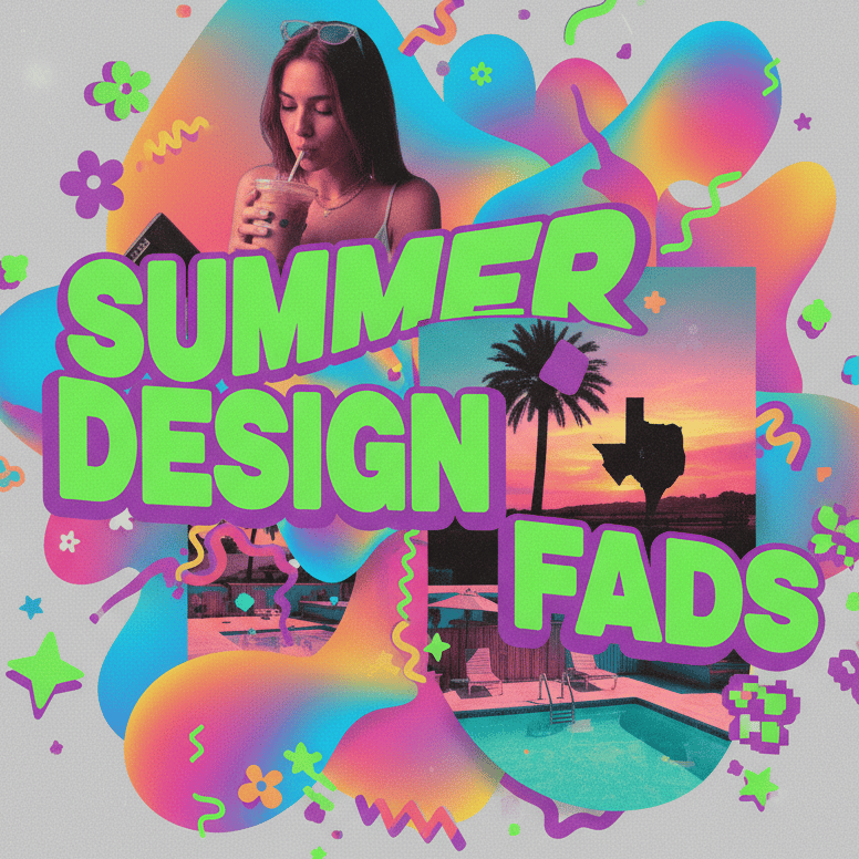
One of the undeniable champions of Summer 2025 was the resurgence of "blobby" or organic shapes. Everywhere you looked, from social media graphics to website hero sections and even product packaging, soft, amorphous forms reigned supreme. These fluid, often asymmetrical shapes offered a refreshing contrast to the sharp geometry that dominated previous years. They brought a sense of movement, whimsy, and approachability, perfect for a season associated with relaxation and spontaneity. Often, these blobs were rendered in bright, gradient colors, adding to their dynamic appeal. This trend wasn't just aesthetic; it also provided a visual metaphor for adaptability and fluidity, resonating with a world constantly in flux.
Another significant fad was the full embrace of bold, maximalist typography. Forget subtle and understated; this summer was about making a statement with text. Oversized, sometimes distorted, and often stacked or intertwined letterforms became commonplace. This wasn't just for headlines; body text often took on a more assertive character. Paired with equally audacious color combinations, this trend demanded attention, reflecting a desire to cut through the noise of digital overload. We saw a lot of retro-futuristic fonts and highly customized lettering, often with a slight Y2K or early 2000s influence, bringing a nostalgic yet fresh vibe to contemporary designs.
Finally, the pervasive use of gradient maps and duotone effects continued its strong run, evolving with even more daring color choices. Instead of simple fades, designers layered complex color transitions over photographs and illustrations, creating surreal and eye-catching visuals. This technique breathed new life into otherwise ordinary imagery, imbuing it with a distinct personality and a contemporary edge. From event posters in Deep Ellum to digital campaigns for local businesses, these vibrant color overlays were inescapable. While some might argue these fads verge on oversaturation, they undeniably contributed to a summer design landscape that felt energetic, optimistic, and delightfully unconventional. As we ease into fall, it will be interesting to see which of these bold statements fade into memory and which continue to inspire future design directions.
#ProcessStudio #GraphicDesignFads #SummerDesign #BlobShapes #MaximalistTypography #GradientMaps

Copyright @ 2025 Process Studio. All Rights Reserved.